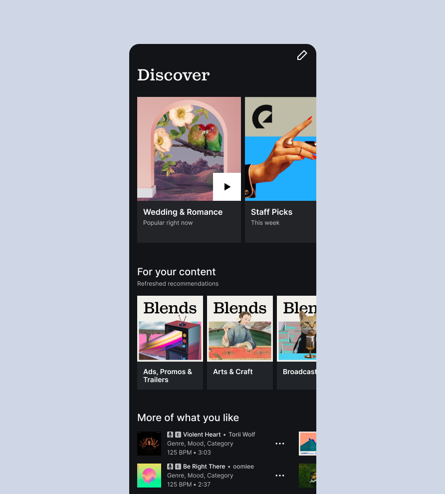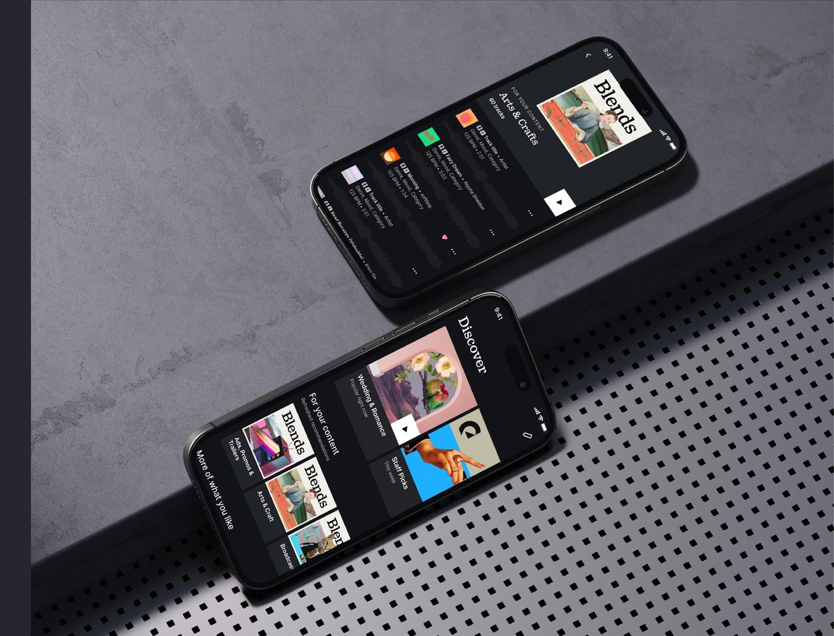
Many first-time users tried the app and didn't return. We learned that people didn't fully get our offering, didn't understand our license model, and struggled to find the right music to hook them. One problem was the first view users landed on, the discover view. Most people never scrolled past the first screen. The content wasn't relevant enough, it felt static, and the covers were so big that seeing anything took a lot of scrolling. The goal was a more engaging first-time experience that brought users back to the app.
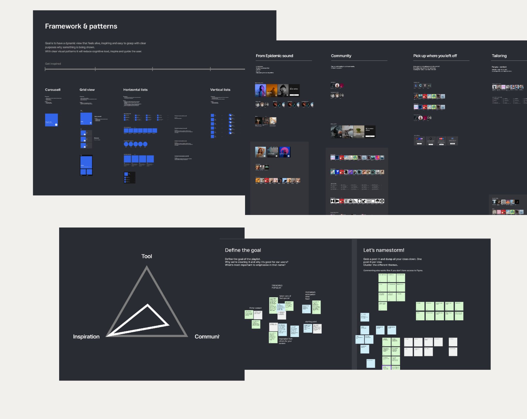
I led the design, concept development, art direction, and end-to-end implementation, working closely with product, tech, brand, and content teams to align around a shared direction. Workshops and research shaped the early concepts, which we then user-tested and iterated on. A second round of workshops pulled everything into a unified concept, keeping stakeholders aligned and bought in along the way.
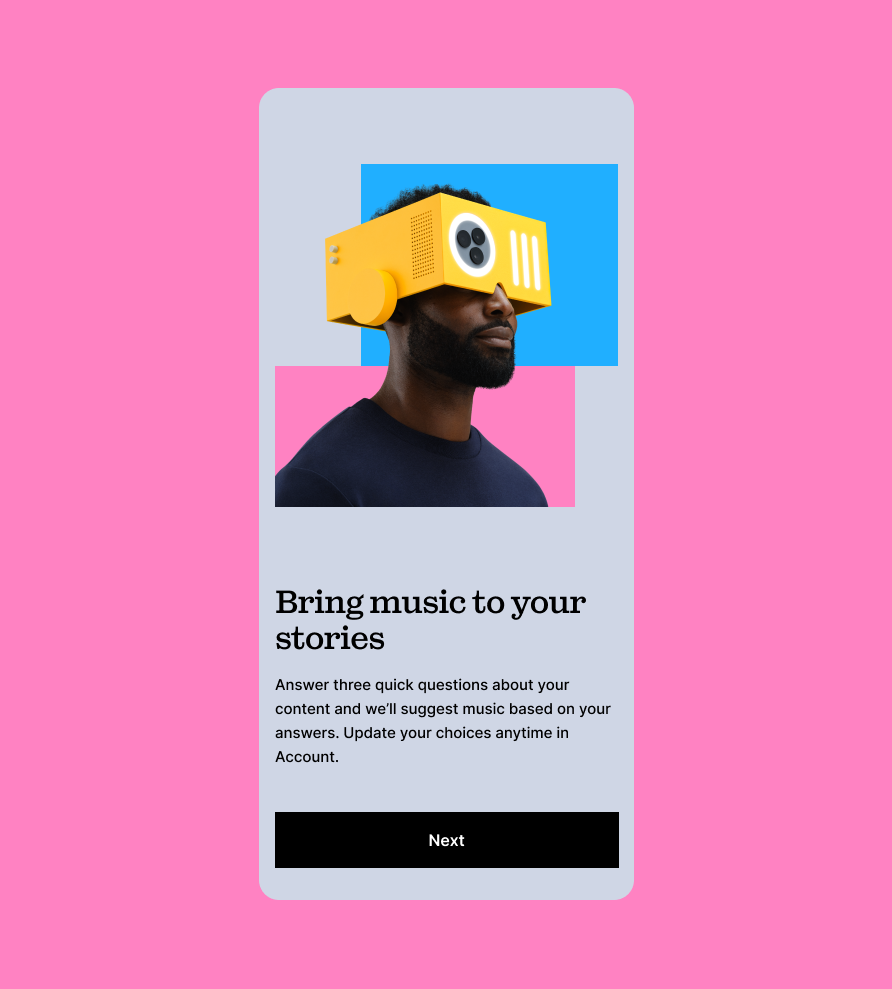
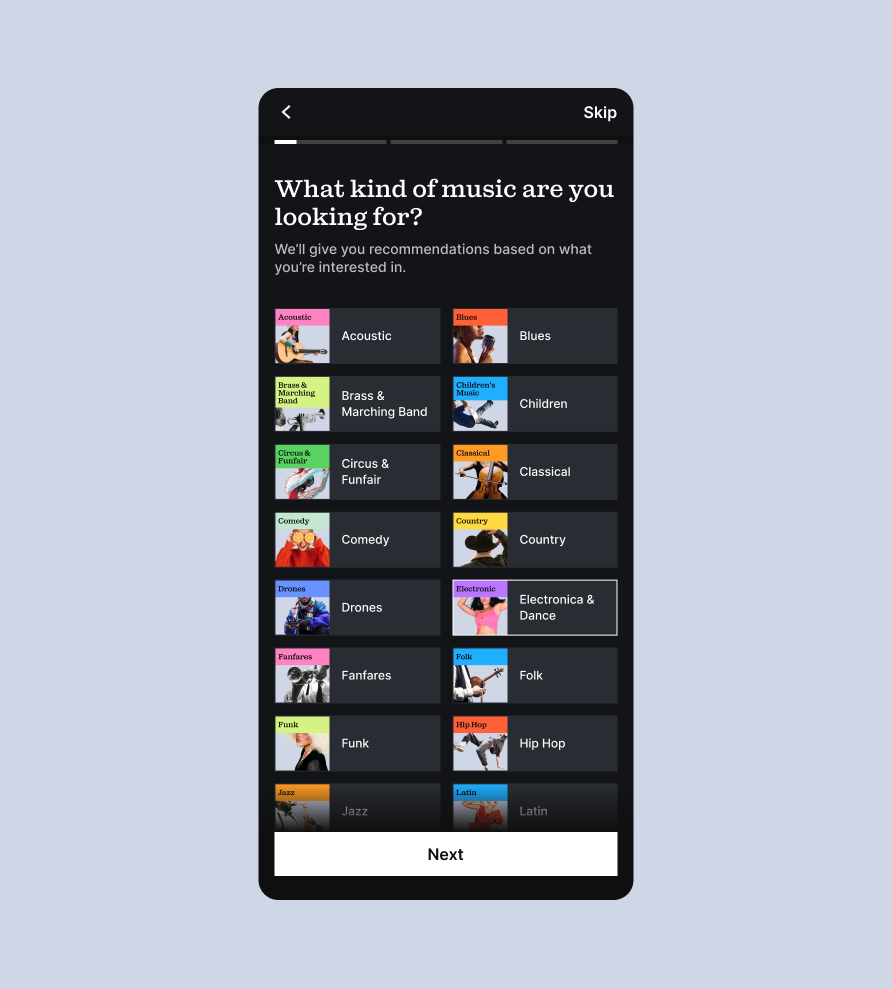
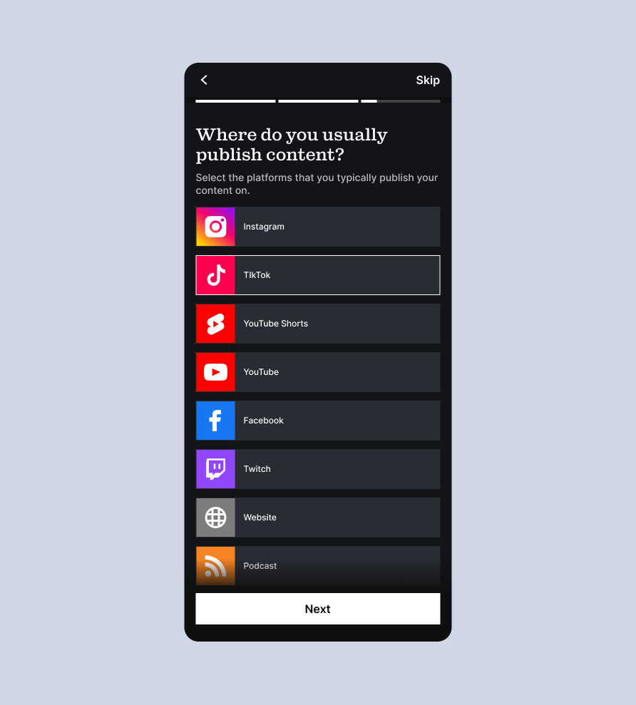
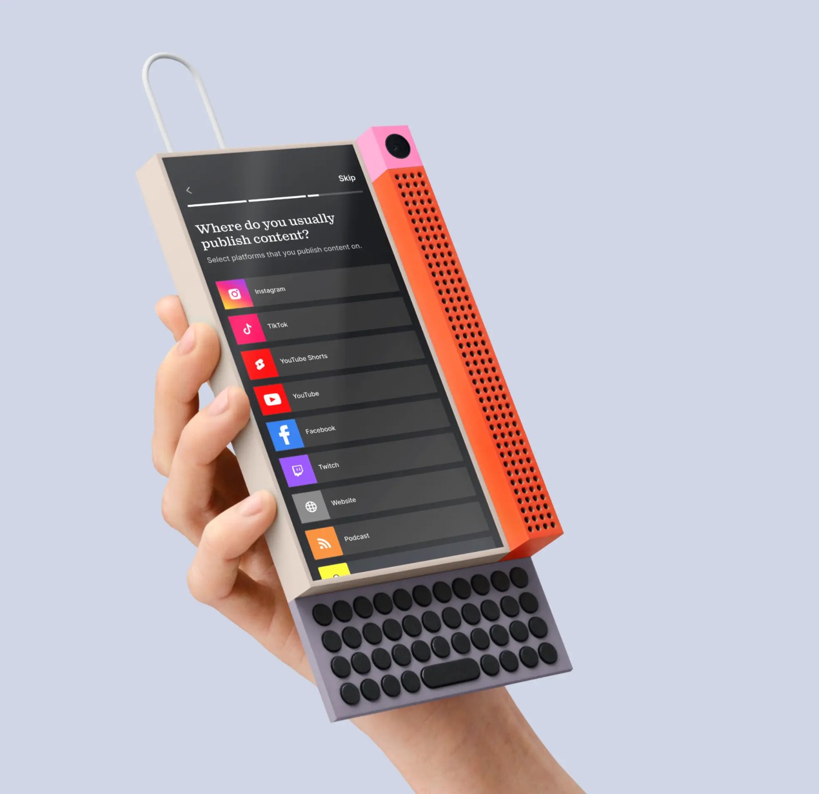
A three-step setup flow got to know first-time users early, enough to surface relevant suggestions from the start. We also added clearer guidance on what was needed before publishing a track, more hand-holding than before to clear up the license confusion.
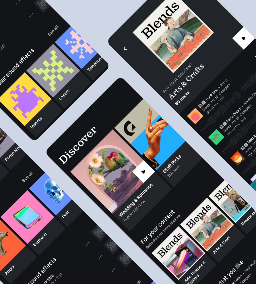
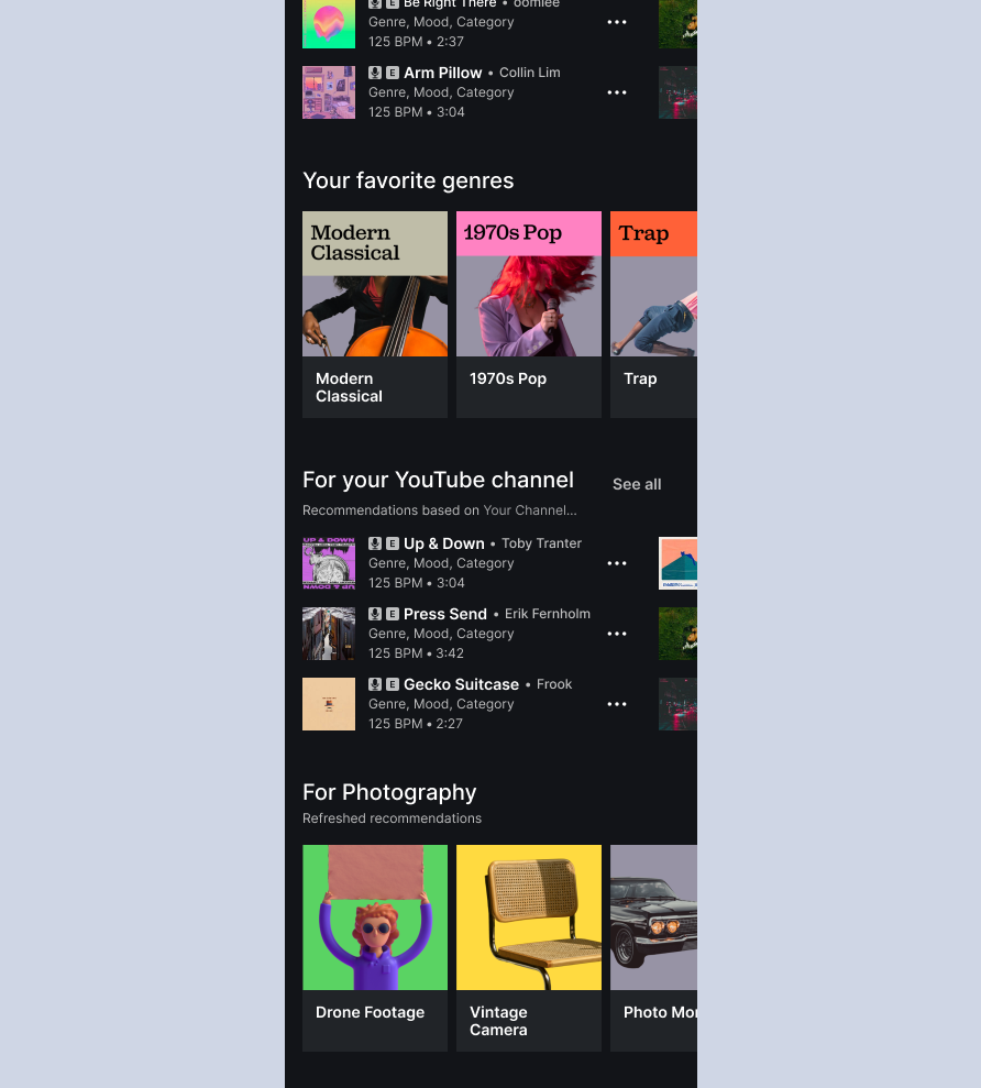
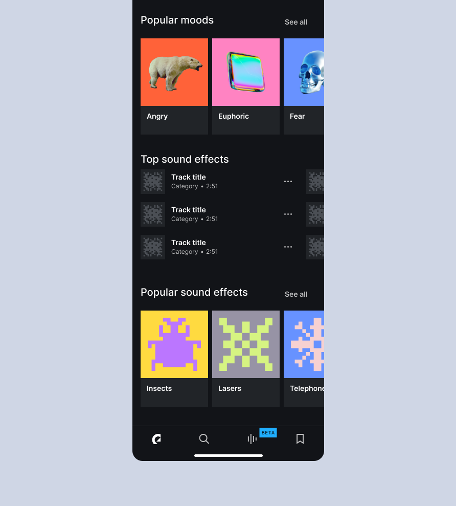
The discover view itself was redesigned around carousels, a familiar pattern that made our catalogue easier to scan and understand. Content was grouped as a mix of curated, new, and inspirational, so the breadth of what we offered came through clearly. On top of that, we created a new playlist format to bring in more personalised content.
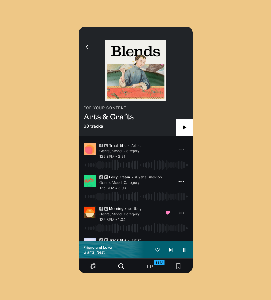
I conceptualised and drove a new playlist format built around community-based picks and tracks matched to similar content, updated weekly. The goal was to make discovery feel more personal and less algorithmic, something people could trust and return to.

Success rate improved: the time it took to find a track and save or download it got noticeably shorter. More people also completed the steps needed to publish a track, which is where people used to get stuck. Our store rating went up in the same period too, though that's harder to tie directly to this work. The setup flow was later rolled out on web as well.
Understanding the technical constraints up front shaped the outcome more than I expected. It's what let us design for the tech and the content we actually had, not what we wished we had. Designing around those limits, together with copy, visuals and structure, is what made the new view work.